Foundations, semantic tokens, reusable components, and child-friendly navigation. One deliberate style across Welcome, Parent Area, My City, Playground, and Library.
01 · Colour foundations
Navy surfaces, legible text, 02C gradient Primary, violet/pink accents. Functional text is never baked into illustration assets.
Inter → system fallbacks. 8px spacing scale, 4px only for micro-adjustments; 12px captions are supplementary rather than essential action text.
Create a worldDisplay · 64/72
Your next drawingHero · 40/48
Explore WorldsPage · 32/40
PlaygroundSection · 24/32
Draw something wonderfulCard · 20/28
Pick up your pencils and draw on real paper.Body · 16/24
CREATE YOUR FIRST DRAWINGLabel · 14/20
03 · Buttons and interaction states
One approved 02C Get Started gradient Primary per standard decision area; a protected multicolor Signature CTA for 06B Handoff only; secondary / tertiary and all interaction states.
The primary demo button shows a non-transactional confirmation; its visual state resets. Never use a disabled button to conceal missing form requirements.
04 · Forms and choice controls
Input labels, persistent help/error text, focus and disabled states. A parent can choose the free path without entering an email.
Filter chips / selections
Use a valid email address, for example parent@example.com.
05 · Cards, statuses and empty states
FREE STARTER · PROTOTYPE
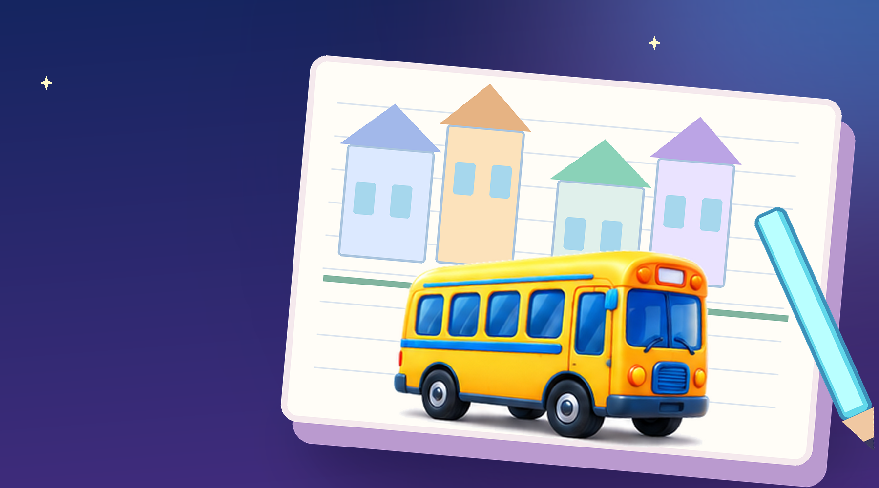
Let's draw a bus!
Follow a short lesson, draw on paper, then capture your creation.
Your drawing is saved on this device.
We couldn't save the photo. Please try again; the drawing on your paper is safe.
Your Library is ready
Your creations will appear here after you take a photo and save them.
06 · Shared navigation
One child rail, five destinations and Parent Area guarded separately. 3D art is supplied as individual transparent WebP assets, not as a flattened screenshot.
One component, every child destination
Select a destination to inspect the consistent selected state. The real app uses shared-child-nav.js; this is a visual reference, not a second production router.
Selected: Home
Nav width: 144px standard · 138px legacy transition
If a 3D icon is not uploaded, the reference falls back to an SVG. Parent Area is an adult-gated action in the real product, never a child-accessible shortcut to purchases.
07 · Platform and accessibility contract
Dimension
Product rule
Implementation note
Tap targets
Target ≥56px preview
Verify ≥44pt on iPadOS; ≥48dp on Android in native UI.
Colour contrast
WCAG AA minimum, 4.5:1 regular text, 3:1 large text and UI boundaries
Evaluate against actual photo/scrim pixels, not only canvas token.
Motion
Brief, purposeful and cancellable
Honor Reduce Motion and Pause; never gate an action behind animation.
Child safety
No pricing or checkout in child paths
Adult gate before account/payment; don't make therapeutic claims.
Data claims
Free sample is real prototype content, not final catalog
Prices, unlock counts and purchase states are proposal only.